Problem
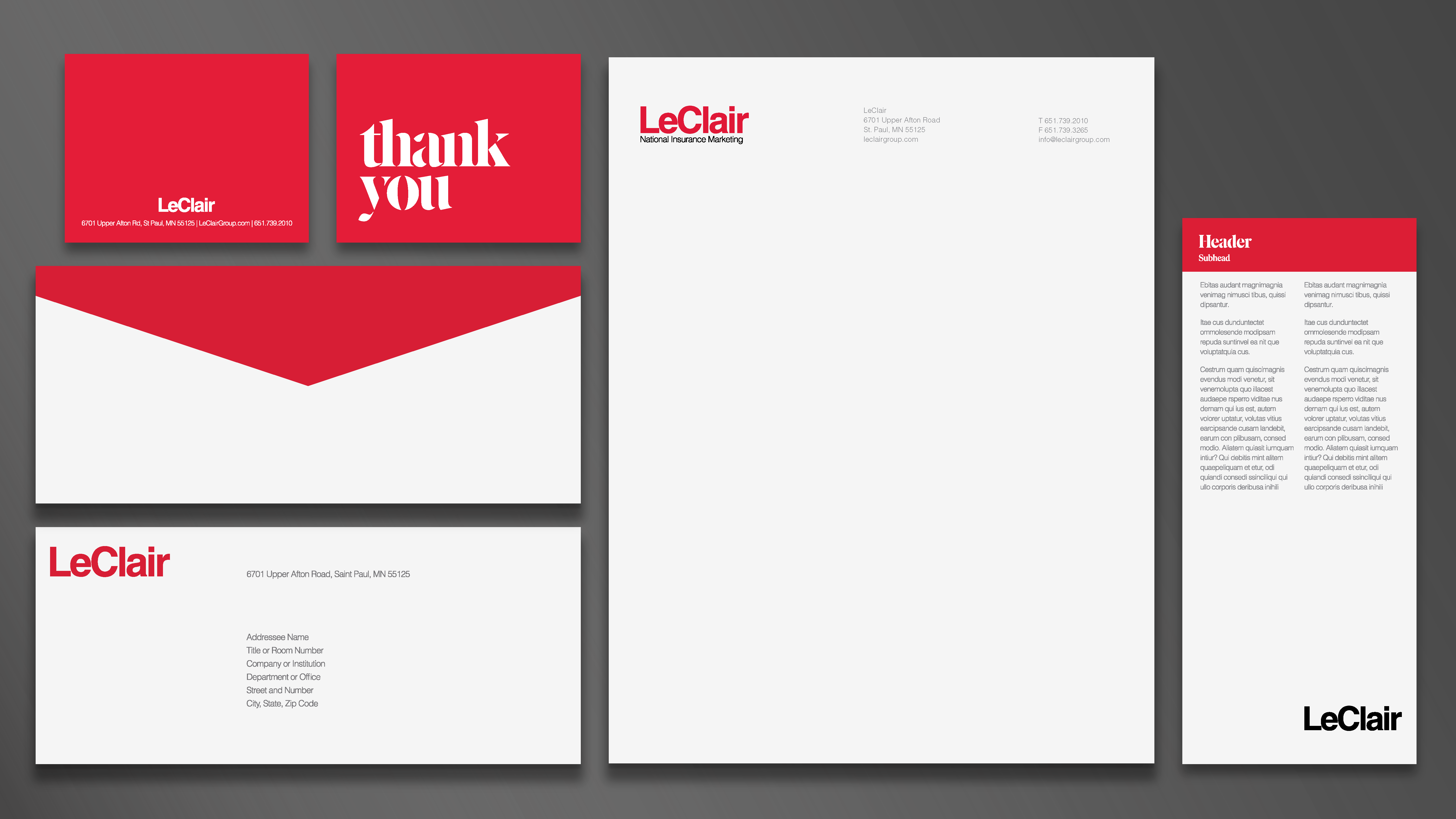
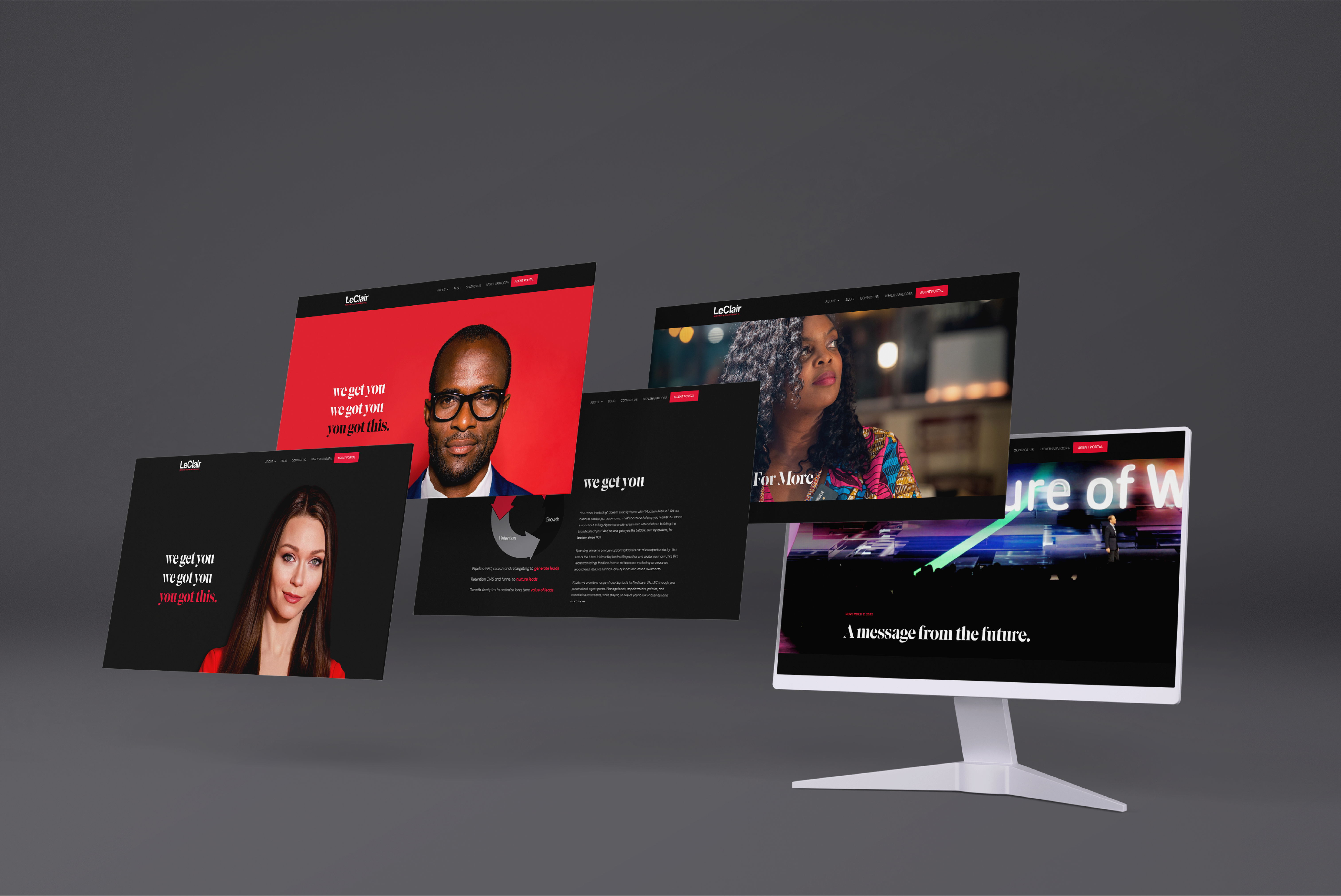
With consolidation increasing in the Health Care industry, Redlbl redefines the story, tone and manner of LeClair Group right down to the pixel.
Health insurance, especially Medicare, is more than filling out interminable forms. LeClair is a go-between the largest names in insurance like Aetna, Blue Cross, and Humana and the millions of consumers that “opt-in” to Medicare each year. Redlbl was hired to modernize their image.
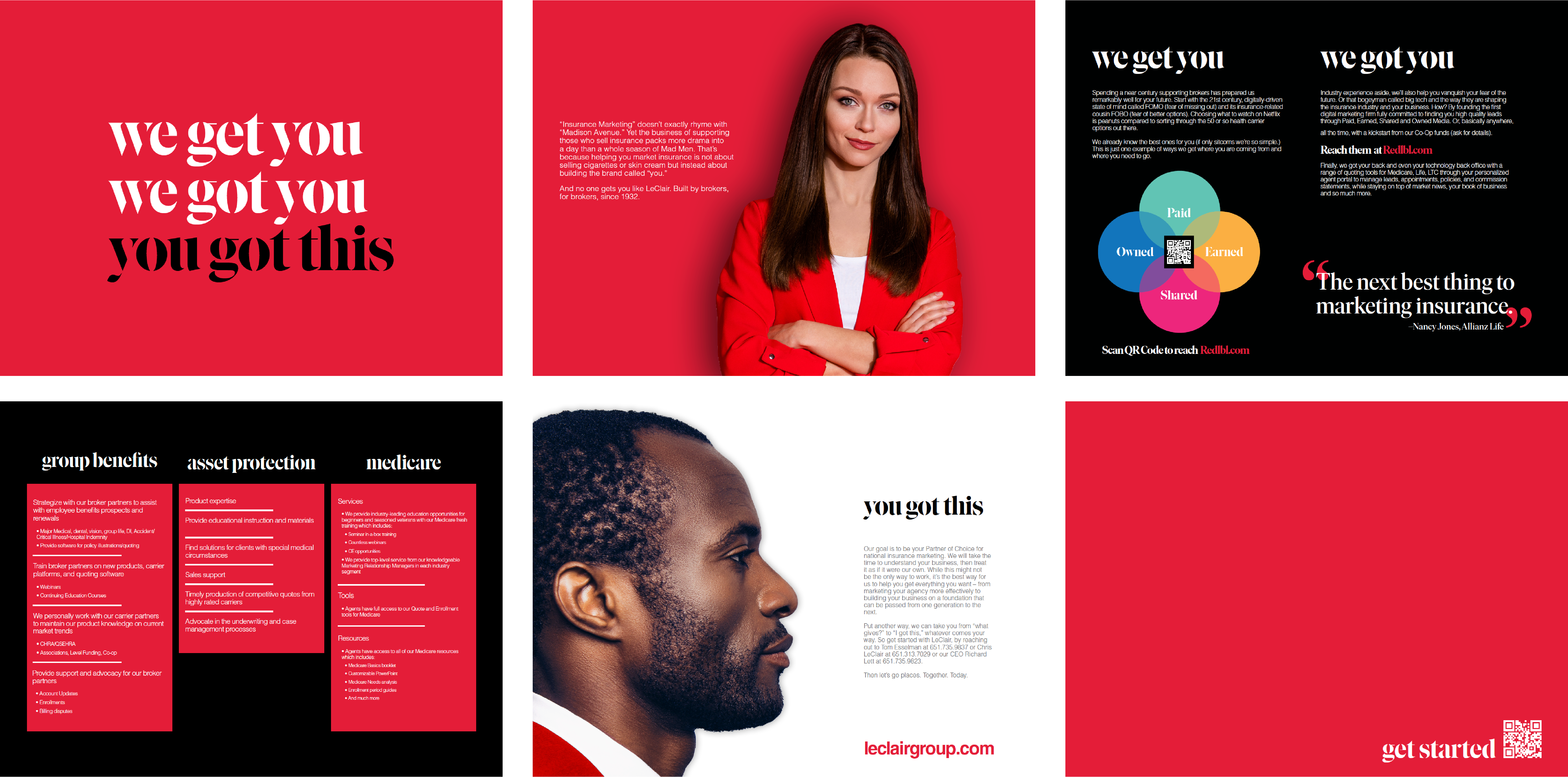
Rebranding was driven by capturing the “Inner Beauty” of their business. Strong lines, bold colors and a supportive storyline conveyed a new level of sophistication. Omnichannel engagement has increased by 283% since launch, which proves that “boring,” when well packaged, can be beautiful.
Solution
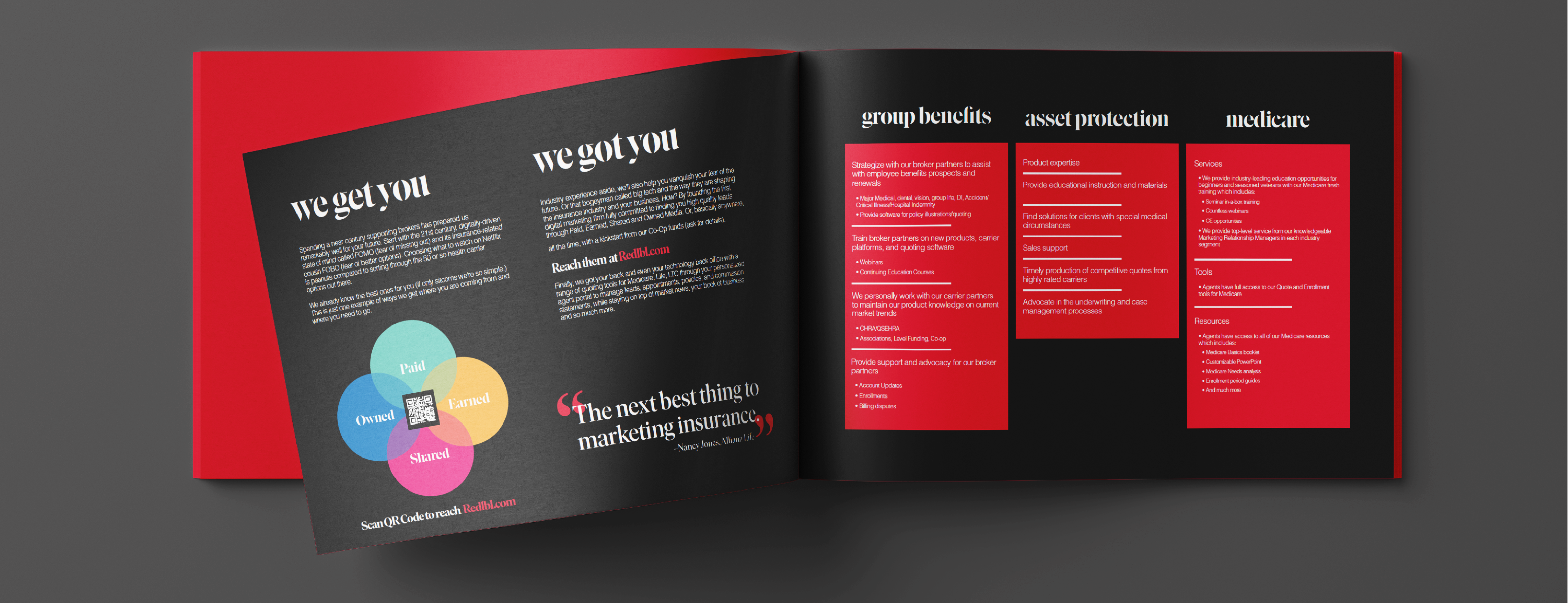
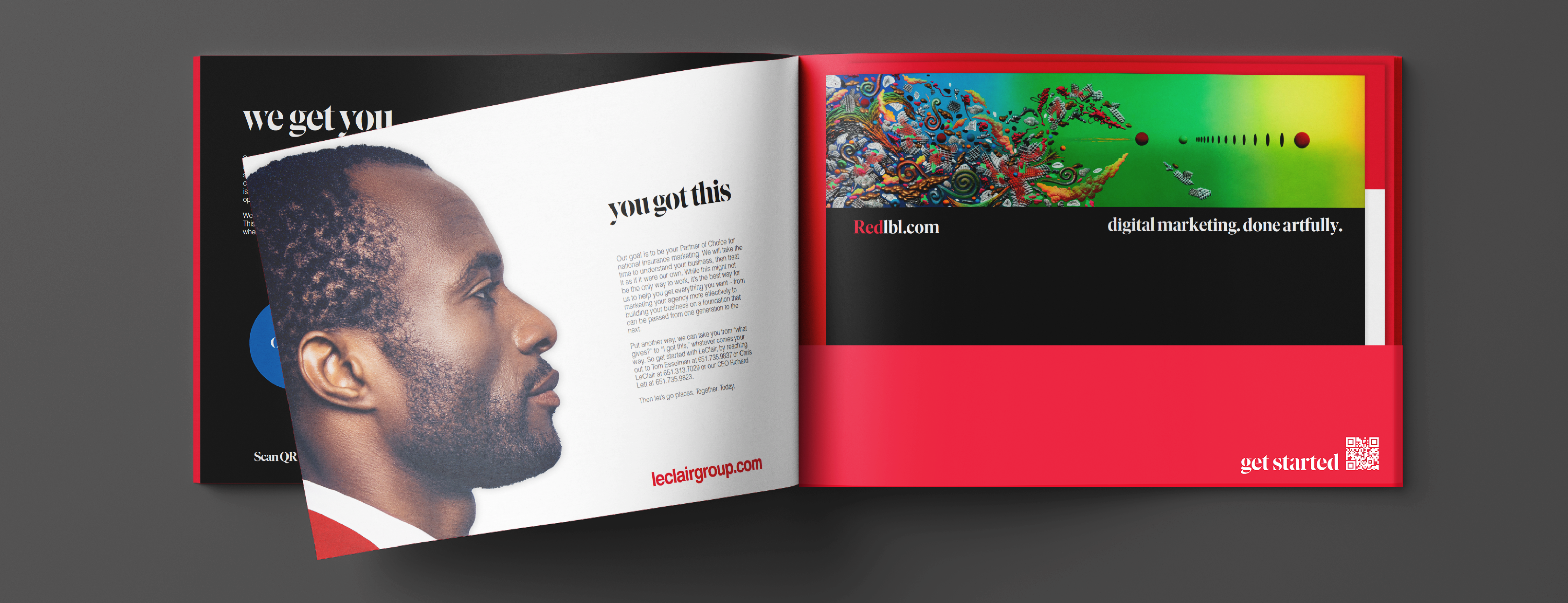
The new branding was launched with web and interactive materials. Field support, on-premise branding and a full Corporate ID were soon added. Recent work is depicted here:
Success
Brand consistency has been reinforced through standards. Primary colors, adaptable grids and balanced typography create a strict yet adaptable platform for the new look of a 90-year old icon.

